A Pandemic Job Search in Numbers
Data Visualization
Background
When COVID-19 took the world by storm, I was wrapping up a fellowship at the GlobalGiving Foundation, gaining skills in data analysis, community centered design, and international development. With the end of this chapter in my life, it was time to look beyond the horizon for the next step in my early-career journey.
Scope
1 Day
Tools
Flourish
As many people experienced during COVID-19, layoffs, economic turmoil, and the uncertainty of our health with no vaccine in sight were a strong concoction for a frightening job market. During this time, my days were consumed with resume reviews, cold call messages, Zoom coffee dates with recruiters, long walks to calm my fears, unemployment forms, more coffee, and countless rejection emails. Still, I found myself to be one of the lucky ones; my family members and I were healthy, I had some savings, and within a few months, I finally had a job offer while so many others were still struggling.
I was grateful to my network and my village of friends and family for getting me to my next role through their support. I also wanted others who were still searching to know that behind every job offer, there are countless rejections and that they weren’t alone in their struggle. I found myself wondering, If I’m going to post my latest fortune on LinkedIn, why not share the journey it took to get there?
The Process
First I gathered my data - sifting through a few hundred emails, I gathered the following numbers:
73
Jobs Applications
33
Interviews*
32
Rejections
39
No Response
1
Offer
*includes Phone Screens, Group Interviews, Homework Assignments, Presentations, and Technical Interviews
I chose these numbers because I felt they showed the different stages of the journey best, along with the possible results. Next, I brainstormed some ideas for how to best tell this story. I wanted to emphasize that the job search doesn’t happen linearly; it is a journey with several overlapping stages, and many failures along the way.


The Job Search Flow
Data Viz Ideas
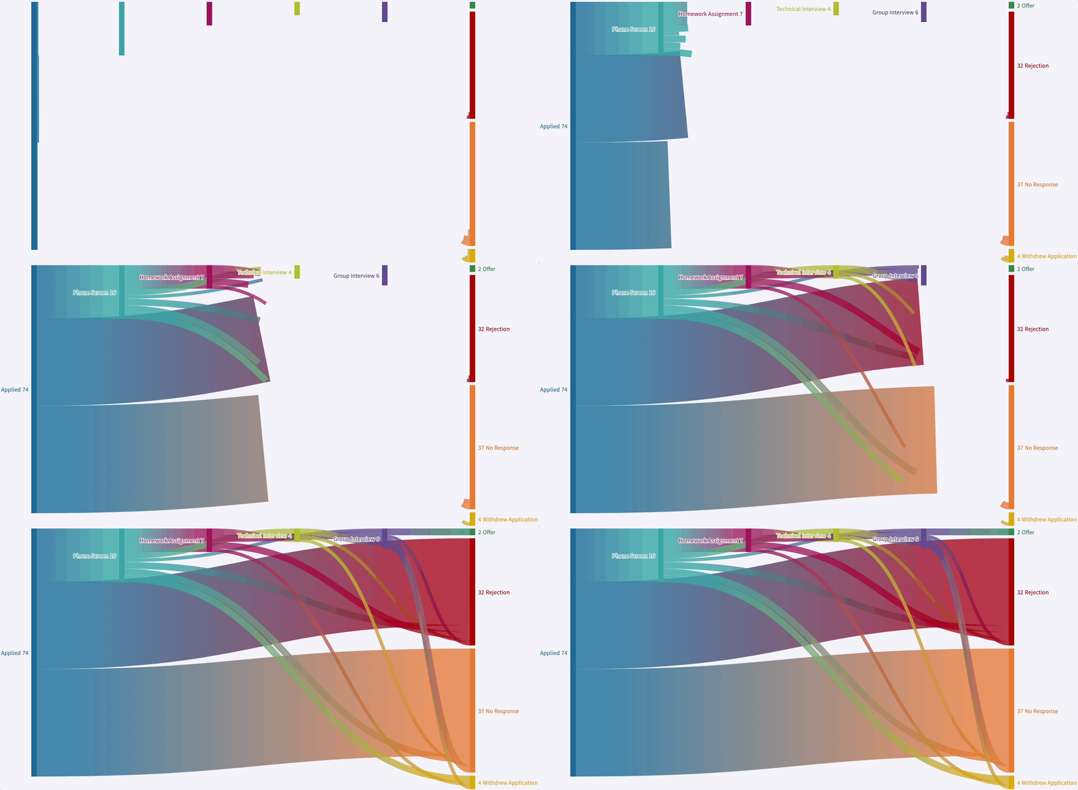
I decided to move forward with creating a Sankey Diagram. I felt this visualization was the best option to illustrate the overlapping steps throughout the job search as well as the many failures along the way. In order to create a Sankey, I had to go back to the data and determine the relationships between each of the different steps (ex. How many Phone Interviews resulted in a Rejection, Technical Interview, and Group Interview, etc.) Finally, I created the visualization in Flourish.
The Result

Six Months of Job Searching in Six Seconds
I took a deep breath and published this viz to LinkedIn. Broadcasting all my failures in this way made me feel very vulnerable. I questioned if it would reflect poorly on me before publishing it. Looking back, perhaps it is not about me at all, but about the process and how we can do better by those who are job hunting. Here are some of my favorite responses that I received from posting this viz on LinkedIn:


Final Thoughts
If I were to do this again, I would try to use color more intentionally, with accessibility in mind. I would also think through some more data points that could paint a fuller story. For example, how much time did I spend in total during this process? What feedback did I receive? How did my network help me along the way?
In the end, it only takes one yes in a sea of no’s.Thank you for reading!